
You are currently browsing the tag archive for the ‘statistics’ tag.
Or more generally, does your initial job placement matter for your long-term success? Or does “bad luck” on the job market eventually wash out? A 2006 paper from Paul Oyer looks at this question.
In this paper, I show that initial career placement matters a great deal in determining the careers of economists. Each place higher in rank of initial insti-tution causes an economist to work at an institution ranked 0.6 places higher in the time period from three to 15 years later. Also, the fact that an economist originally gets a job at a top-50 institution makes that economist 60 percent more likely to work at a top-50 school later in his or her career. While it would obviously come as no surprise to find that economists at higher-ranked schools have higher research output, I will present evidence that for a given economist—that is, holding innate ability constant— obtaining an initial placement at a higher-ranked institution leads to greater professional productivity.
He circumvents the obvious endogeneity issue: there may be some measure of your quality that can’t be observed in the data and then lower initial placement is going to be correlated with lower intrinsic quality. The way he gets around this is to compare cohorts in strong-market years with cohorts from weaker years. Suppose that the business cycle is uncorrelated with your intrinsic skill and bad times means worse than usual placement. Then the same quality worker will have worse placement in weak-market years.
In fact, Oyer finds that students who enter the market in weak years are less successful even in the long run. This is evidence that their initial placement mattered.
There remain some selection problems, however. For example, students have choice over which year to enter the market. It could be that, anticipating the worse placements, the best students enter the market a year before a downturn or wait a year after. Also, in bad years the best students might find altogether better alternatives than academia and go to the private sector.
Here’s my idea for a different instrument: couples. It often happens that a student on the market has a spouse who is seeking a job in the private sector. Finding a good job in the same city for both partners is more constraining than a solo search and typically the student will have to compromise, taking their seond- or third-best offer.
If being married at the time of entering the market is uncorrelated with your unobservable talent as an economist, then a difference in the long-run success of PhDs with dual searches would be evidence of the effect of initial placement.
(I would focus on academic-private sector couples. In an academic-academic couple, the two quite often market themselves as a bundle to the same institution and the worse of the two gets a better placement than he would if he were solo. But it would be interesting to compare academic-academics to academic-private.)
(Casquette cast: Seema Jayachandran)
Job market interviewing entails a massive duplication of effort. You interview with each of your potential employers individually imposing costs on them and on you. Even in the economics PhD job market, a famously efficient matching process, we go through a ridiculous merry-go-round of interviews over an entire weekend. Each candidate gives essentially the same 30 minute spiel to 20 different recruiting committees.
What if we assigned a single committee to interview every candidate and webcast it to any potentially interested employer? Most recruiting chairs would applaud this but candidates would hate it. Both are forgetting some basic information economics.
Candidates hate this idea because with only one interview, a bad performance would ruin their job market. With many interviews there are certain to be at least a few that go smoothly. But of course there is a flip-side to both of these. If the one interview goes very well, they will have a great outcome. With many interviews there are certain to be a few that go badly. How do these add up?
Auction theory gives a clear answer. Let’s rate the quality of an interview in terms of the wage it leads your employer to be willing to pay. Suppose there are two employers and you give them separate interviews. Competitive bidding will drive the wage up until one of them drops out. That will be the lower of the two employer’s willingness to pay.
On the other hand, if both employers saw the outcome of the same interview, then both would have the same willingness to pay equal to the quality of that one interview. On average the quality of one draw from a distribution is strictly larger than the minimum of two draws from the same distribution. You get a higher wage on average with a single interview.
What’s going on here is that the private information generated by separate interviews gives each employer some market power, so-called information rents. By pooling the information you put the employers on equal footing and they compete away all of the gains from employment, to your benefit.
In fact, pooling interviews is even better than this argument suggests due to another basic principle of information economics: the winner’s curse. When interviews are separate, each employe rs’ willingness to pay is based on the quality of the interview and whatever he believes was the quality of the other interview. Both interviews are informative signals of your talent. Without knowing the quality of the other interview, when bidding for your labor each employer worries that he might win the bidding only because you tanked the other interview. Since this would be bad news for the winner (hence the curse), each bidder bids conservatively in order to avoid overpaying in such a situation. Your wage suffers.
By pooling interviews you pool the information and take away any doubts of this form. Without the winner’s curse, employers can safely bid aggressively for you.
Going back to the original intuition, its true there are upsides and downsides of having separate interviews but the mechanics of competition magnify the downsides through both of these channels, so in the end separate interiews leads to a lower wage on average than if they were pooled.
Perhaps this explains why, despite their grumblings, economics department recruiters are still willing to spend 18 hours locked in a windowless hotel room conducting interviews.
Addendum: A commenter asked about competition by more than two employers. If six are bidding for you, then eventually the wage has been bid up until four have dropped out of the competition. The price at which they drop out reveals their information to the two remaining competitors. At that point the two-bidder argument applies.
The Sports Economist picks up on the economic impact of Tiger’s expected absence from professional golf tournaments this year.
But it may be a boon to academia. I previously blogged about Jen Brown’s research on “the Tiger Woods effect” as evidence of strategic effort in contests. In tournaments with Tiger Woods present, the rest of the field performs noticably worse than in tournaments in which he was absent. While that study was careful to note and account for the possibility that Tiger’s absence (by choice) from a tournament might be correlated with some unobservable factor that could bias the conclusion, these concerns are always present.
Fortunately, over the next year we will have a nice natural experiment due to the fact that Tiger’s absence will represent truly independent variation. Looking forward to seeing an update on the Tiger Woods effect. (Trilby toss: Matt Notowidigdo.)
In the top tennis tournaments there is a limited instant-replay system. When a player disagrees with a call (or non-call) made by a linesman, he can request an instant-replay review. The system is limited because the players begin with a fixed number of challenges and every incorrect challenge deducts one from that number. As a result there is a lot of strategy involved in deciding when to make a challenge.
Alongside the challenge system is a vestige of the old review system where the chair umpire can unilaterally over-rule a call made by the linesman. These over-rules must come immediately and so they always precede the players’ decision whether to challenge, and this adds to the strategic element.
Suppose that A’s shot lands close to B’s baseline, the ball is called in by the linesman but this call is over-ruled by the chair umpire. In these scenarios, in practice, it is almost automatic that A will challenge the over-ruled call. That is, A asks for an instant-replay hoping it will show that the ball was indeed in.
This seems logical. It looked in to the linesman and that is good information that it was actually in. For example, compare this scenario to the one in which the ball was called out by the linesman and that call was not over-ruled. In that alternative scenario, one party sees the the ball out and no party is claiming to see the ball in. In the scenario with the over-rule, there are two opposing views. This would seem to make it more likely that the ball was indeed in.
But this is a mistake. The chair umpire knows when he makes the over-rule that the linesman saw it in. He factors that information in when deciding whether to over-rule. His willingness to over-rule shows that his information is especially strong: strong enough to over-ride an opposing view. And this is further reinforced by the challenge system because the umpire looks very bad if he over-rules and a challenge shows he is wrong.
I am willing to bet that the data would show challenges of over-ruled calls are far less likely to be successful than the average challenge.
A separate observation. The challenge system is only in place on the show courts. Most matches are played on courts that are not equipped for it. I would bet that we could see statistically how the challenge system distorts calls by the linesmen and over-rules by the chair umpire by comparing calls on and off the show courts.
In principle a prediction market should generate more accurate predictions than a simple poll. For example, in an election, the outcome of a poll should be known to the traders and incorporated into their trades. But in practice, the advantage of prediction markets is small, or so suggests a new study.
In a new study, Daniel Reeves, Duncan Watts, Dave Pennock and I compare the performance of prediction markets to conventional means of forecasting, namely polls and statistical models. Examining thousands of sporting and movie events, we find that the relative advantage of prediction markets is remarkably small. For example, the Las Vegas market for professional football is only 3% more accurate in predicting final game scores than a simple, three parameter statistical model, and the market is only 1% better than a poll of football enthusiasts.
More here. My view is that there is no theoretical reason for interpreting a market price in a prediction market as a probability. That is, if Coakley is trading at 75 cents there is no reason to interpret that as a 75 percent probability that Coakley will win. At best there is an ordinal relationship: a higher price means a higher probability. Likewise with a poll.
Studies like these should instead be measuring the conditional probability of an event given the price observed in the market. Because, even an “innacurate” prediction can be a very good one. To take an extreme case the market might always underprice the probability of a Coakley win by 25%. But then by dividing the market price by .75 we can infer the right probability with perfect accuracy.
Or dead salmon?
By the end of the experiment, neuroscientist Craig Bennett and his colleagues at Dartmouth College could clearly discern in the scan of the salmon’s brain a beautiful, red-hot area of activity that lit up during emotional scenes.
An Atlantic salmon that responded to human emotions would have been an astounding discovery, guaranteeing publication in a top-tier journal and a life of scientific glory for the researchers. Except for one thing. The fish was dead.
Read here for a lengthy survey of the pitfalls of fMRI analysis. Via Mindhacks.
In this video, Steve Levitt and Stephen Dubner talk about their finding that you are 8 times more likely to die walking drunk than driving drunk.
Levitt says this
“anybody could have done it, it took us about 5 minutes on the internet trying to figure out what some of the statistics were… and yet no one has every talked or thought about it and I think that’s the power of ideas… ways of thinking about the world differently that we are trying to cultivate with our approach to economics.”
Dubner cites the various ways a person could die walking drunk
- step off the curb into traffic.
- mad dash across the highway.
- lie down and take a nap in the road.
Which leads him to see how obvious it is ex post that drunk walking is so much more dangerous than drunk driving.
I thought a little about this and it struck me that riding a bike while drunk should be even more dangerous than walking drunk. I could
- roll or ride off a curb into traffic.
- try to make a mad dash across an intersection.
- get off my bike so that i can lie down in the road to take a nap.
plus so many other dangerous things that i can do on my bike but could not do on foot. And what the hell, I have 5 minutes of time and the internet so I thought I would do a little homegrown freakonomics to test this out. Here is an excerpt from their book explaining how they calculated the risk of death by drunk walking.
Let’s look at some numbers, Each year, more than 1,000 drunk pedestrians die in traffic accidents. They step off sidewalks into city streets; they lie down to rest on country roads; they make mad dashes across busy highways. Compared with the total number of people killed in alcohol-related traffic accidents each year–about 13,000–the number of drunk pedestrians is relatively small. But when you’re choosing whether to walk or drive, the overall number isn’t what counts. Here’s the relevant question: on a per-mile basis, is it more dangerous to drive drunk or walk drunk?
The average American walks about a half-mile per day outside the home or workplace. There are some 237 million Americans sixteen and older; all told, that’s 43 billion miles walked each year by people of driving age. If we assume that 1 of every 140 of those miles are walked drunk–the same proportion of miles that are driven drunk–then 307 million miles are walked drunk each year.
Doing the math, you find that on a per-mile basis, a drunk walker is eight times more likely to get killed than a drunk driver.
I found the relevant statistics for cycling here, on the internet. I calculate as follows. Estimates range between 6 and 21 billion miles traveled by bike in a year. Lets call it 13 billion. If we assume that 1 out of every 140 of these miles are cycled drunk, then that gives about 92 million drunk-cycling miles. There are about 688 cycling related deaths per year (average for the years 200-2004.) Nearly 1/5 of these involve a drunk cyclist (this is for the year 1996, the only year the data mentions.) So that’s about 137 dead drunk cyclists per year.
When you do the math you find that there are about 1.5 deaths per every million miles cycled drunk. By contrast, Levitt and Dubner calculate about 3.3 deaths per every million miles walked drunk.
Is walking drunk more dangerous than biking drunk?
Here is another piece of data. Overall (drunk or not) the fatality rate (on a per-mile basis) is estimated to be between 3.4 and 11 times higher for cyclists than motorists. From Levitt and Dubner’s conclusion that drunk walking is 8 times more dangerous than drunk driving we can infer that there are about .4 deaths per million miles driven drunk. That means that the fatality rate for drunk cyclists is only about 3.8 times higher than for drunk motorists.
That is, the relative riskiness of biking versus driving is unaffected (or possibly attenuated) by being drunk. But while walking is much safer than driving overall, according to Levitt and Dubner’s method, being drunk reverses that and makes walking much more dangerous than both biking and driving.
There are a few other ways to interpret these data which do not require you to believe the implication in the previous paragraph.
- There was no good reason to extrapolate the drunk rate of 1 out of every 140 miles traveled from driving (where its documented) to walking and biking (where we are just making things up.)
- Someone who is drunk and chooses to walk is systematically different than someone who is drunk and chooses to drive. They are probably not going to and from the same places. They probably have different incomes and different occupations. Their level of intoxication is probably not the same. This means in particular that the fatality rate of drunk walkers is not the rate that would be faced by you and me if we were drunk and decided to walk instead of drive. To put it yet another way, it is not drunk walking that is dangerous. What is dangerous is having the characteristics that lead you to choose to walk drunk.
These ideas, especially the one behind #2 were the hallmark of Levitt’s academic work and even the work documented in Freakonomics. His reputation was built on carefully applying ideas like these to uncover exciting and surprising truths in data. But he didn’t apply these ideas to his study of drunk walking. Of course, my analysis is no better. I just copied some numbers off a page I found on the internet and applied the Levitt Dubner calculation. It only took me 5 minutes. (And I would appreciate if someone can check my math.) But then again, I am not trying to support a highly dubious and dangerous claim:
So as you leave your friend’s party, the decision should be clear: driving is safer than walking. (It would be even safer, obviously , to drink less, or to call a cab.) The next time you put away four glasses of wine at a party, maybe you’ll think through your decision a bit differently. Or, if you’re too far gone, maybe your friend will help sort things out. Because friends don’t let friends walk drunk.
When you learn to snowboard you make a commitment before you begin whether you will ride regular or “goofy.” Goofy means you place your right foot in front. As the name suggests, goofy footers are the minority. Since snowboard bindings must be fixed in place for regular or goofy foot, somebody who doesn’t know whether they are goofy will more likely start out regular (because its the best guess and because most rental boards will be setup for regular foot.) Even if they are naturally goofy, once they invested a day learning, they are unlikely to switch and try it out and so may never know.
A surfboard is foot-neutral. Anybody can ride any given surfboard whether they are regular or goofy. And jumping up on a surfboard for the first time happens so fast that you have no time to even think which foot is going forward. So a surfer is very likely to find his natural footing early on, unless he learned to snowboard already in which case he will naturally jump to the footing he is used to.
We should be able to see the effect of this by comparing a regular-foot snowboarder who first learned to surf with a regular-foot surfer who first learned to snowboard. The first guy is going to be better at snowboarding than the second guy is at surfing.
What will be the comparison for goofies?
A simple implication of sexual selection is that there should be a correlation between features that attract us sexually and characteristics that make our offspring more fit. Here is an article that studies the link between physical attraction and success in sport.
The better an American football player, the more attractive he is, concludes a team led by Justin Park at the University of Bristol, UK. Park’s team had women rate the attractiveness of National Football League (NFL) quarterbacks: all were elite players, but the best were rated as more desirable.
Meanwhile, a survey of more than a thousand New Scientist Twitter followers reveals a similar trend for professional men’s tennis players.
Neither Park nor New Scientist argue that good looks promote good play. Rather, the same genetic variations could influence both traits.
“Athletic prowess may be a sexually selected trait that signals genetic quality,” Park says. So the same genetic factors that contribute to a handsome mug may also offer a slight competitive advantage to professional athletes.
Studies like this are prone to endogeneity problems because success also feeds back on physical attraction. At the extreme, we know who Roger Federer is and that gets in the way of judging his attractiveness directly. More subtly, if you show me pictures of two anonymous athletes, the one who is more successful has probably also trained better, eaten better, been raised differently and these are all endogenous characteristics that affect attractiveness directly. Knowing that they correlate with success doesn’t tell us whether “success genes” have physically attractive manifestations.
One way to improve the study would be to look at adopted children. Show subjects pictures of the athletes’ biological parents and ask the subjects to rate the attractiveness of the parents. Then correlate the responses with the performance of the children. If these children were raised by randomly selected parents (obviously that is not exactly the case) then we would be picking up the effect of exogenous sources of physical attractiveness passed on only through the genes of the parents.
And why stop with success in sport. Physical attractiveness should be correlated with intelligence, social mobility, etc.
Is it an infinite number of monkeys, or is it infinitely-lived monkeys? If what you want is Shakespeare with probability 1 it matters. Because Hamlet is a fixed finite string of characters. That means the monkey has to stop typing when the string is complete. If we model the monkey as a process which every second taps a random key from the keyboard according to a fixed probability distribution, then to produce the Dithering Dane he must eventually repeat the space bar (or equivalently no key at all) until his terminal date.
If that terminal date is infinity, i.e. the monkey is given infinite time, then this event has probability zero. On the other hand, an infinite number of monkeys who each live long enough, but not infinitely long, will Exuent with probability 1 as desired.
(If your criterion is simply that the text of Hamlet appear somewhere in the output string, then a) you are sorely lacking in ambition and b) it no longer matters which version of infinity you have.)
Mortarboard Missive: Marginal Revolution.
It is one of the most basic premises of economics and decision theory. If you give a decision-maker better information about the consequences, he will make better choices.
This principle underlies one of the least controversial forms of paternalism: subsidizing information to improve welfare. It is uncontroversial because unlike policies which restrict or direct behavior, it doesn’t take a stand on what is good for the decision-maker. More information helps her achieve her desired outcomes, whatever they may be.
In New York City, fast food chains were required to conspicuously publish calorie counts for all of their offerings. This will enable customers to make better decisions, presumably in terms of health consequences. According to the theory, any change in behavior in response to the new information is evidence that the policy was a success. It reveals that people made use of the information.
…when the researchers checked receipts afterward, they found that people had, in fact, ordered slightly more calories than the typical customer had before the labeling law went into effect, in July 2008.
Here is the conclusion drawn by an author of the study:
“I think it does show us that labels are not enough,” Brian Elbel, an assistant professor at the New York University School of Medicine and the lead author of the study, said in an interview.
Mindhacks discusses a surprising asymmetry. Journalists discussing sampling error almost always emphasize the possibility that the variable in question has been under-estimated.
For any individual study you can validly say that you think the estimate is too low, or indeed, too high, and give reasons for that… But when we look at reporting as a whole, it almost always says the condition is likely to be much more common than the estimate.
For example, have a look at the results of this Google search:
“the true number may be higher” 20,300 hits
“the true number may be lower” 3 hits
There are two parts to this. First, the reporter is trying to sell her story. So she is going to emphasize the direction of error that makes for the most interesting story. But that by itself doesn’t explain the asymmetry.
Let’s say we are talking about stories that report “condition X occurs Y% of the time.” There is always an equivalent way to say the same thing: “condition Z occurs (100-Y)% of the time” (Z is the negation of X.) If the selling point of the story is that X is more common than you might have thought, then the author could just as well say “The true frequency of Z may be lower” than the estimate.
So the big puzzle is why stories are always framed in one of two completely equivalent ways. I assume that a large part of this is
- News is usually about rare things/events.
- If you are writing about X and X is rare, then you make the story more interesting by pointing out that X might be less rare than the reader thought.
- It is more natural to frame a story about the rareness of X by saying “X is rare, but less rare than you think” rather than “the lack of X is common, but less common than you think.”
But the more I think about symmetry the less convinced I am by this argument. Anyway I am still amazed at the numbers from the google searches.
I wrote
If I am of average ability then the things I see people say and do should, on average, be within my capabilities. But most of the things I see people say and do are far beyond my capabilities. Therefore I am below average.
I am illustrating a fallacy of course, but it is one that I suspect is very common because it follows immediately from a fallacy that is known to be common. People don’t take into account selection effects. The people who get your attention are not average people. Who they are and what they say and do are subject to selection at many levels. First of all they were able to get your attention. Second, they are doing what they are best at which is typically not what you are best at. Also, they are almost always imitating or echoing somebody else who is even more talented and specialized so as to have gotten their attention.
Its healthy to recognize that you can be the world leader at being you even if you suck at everything else.
WordPress give statistics on keyword searches that led users to Cheap Talk. I am amused and intrigued by many of the leaders:
#1 cheap talk
#2 tv
?? About 20 times a day somebody googles tv, they are offered up a link to our blog and they click through. The clicking through part I can understand but why a search on tv hits us is beyond me (when I try it I go through several pages of google hits and do not find a cheap talk link.) And who googles “tv” ?
#8 hefty smurf
That one is my favorite. I get a daily chuckle out of that one.
#9 flatfish
~#20 Wynne Godley
~#30 talking robots
~#33 model men
nice!
~#50 men and their mothers
oops.
~#60 Guinness serving temperature
I am pleased to be the go-to authority on the proper serving temperature of this important beverage.
If I am of average ability then the things I see people say and do should, on average, be within my capabilities. But most of the things I see people say and do are far beyond my capabilities. Therefore I am below average.
Tyler Cowen blegs for ideas on the economics of randomized trials. There is a simple and robust insight economic theory has to offer the design of randomized trials: controlling incentives in order to reduce ambiguity in the measurement of effectiveness.
Suppose you are testing a new drug that must be taken on a daily basis. A typical problem is that some patients stop taking the drug but for various reasons do not inform the experimenters. The problem is not the attrition per se because if the attrition rate were known, this could be used to identify the take-up rate and thereby the effectiveness of the drug.
The problem is that without knowing the attrition rate in advance there is no way to independently identify it: the uncertainty about the attrition rate becomes entangled with the uncertainty about the drug’s effectiveness. The experimenters could assume some baseline attrition rate, but when the effectiveness results come out on the high side, there is always the possibility that this is just because the attrition rate for this particular experiment was lower than usual.
The simple way to solve this problem is to use selective trials rather than randomized trials: require patients in the study to pay a price to remain in the study and continue to receive the drug. If the price is high enough, only those patients who actually intend to take the drug will pay the price. Thus the attrition rate can be directly observed by noting which patients continued to pay for the drug. This removes the entanglement and allows statistical identification of the effectiveness of the drug.
This is one of a number of new ideas in a new paper by Sylvain Chassang, Gerard Padro i Miquel and Erik Snowberg.
Followup: Sylvain Chassang points me to two experimental papers that explore/implement similar ideas:
http://www.dartmouth.edu/~jzinman/Papers/OU_dec08.pdf
http://faculty.chicagobooth.edu/jesse.shapiro/research/commit081408.pdf
If a drug trial reveals that patients receiving the drug did not get any healthier than those who took a placebo, is this a failure? It depends what the alternative treatment is. Implicitly its a failure if we believe that doctors will prescribe a placebo rather than the drug. Of course they don’t do that (often) but we can think of the placebo as representing the next-best alternative treatment.
But the right question is not whether the drug does better than the next-best alternative, but instead whether the drug plus the alternatives does better than just the alternatives. It could happen that the drug by itself does no better than placebo because the placebo effect is strong, but the drug offers an independent effect that is just as strong.
If so, then the right way to do placebo trials is to give one group a placebo and another group the placebo plus the drug being tested. The problem here is that the placebo group would know they are getting placebo which presumably diminishes its effect. So instead we use four groups: drug only, placebo only, drug plus placebo, two placebos.
Maybe this is done already.
Followup: Thanks to some great commenters I thought a little more about this. Here is another way to see the problem. Conceivably there may be a complementarity between the placebo effect (whatever causes it) and the physiological effect of the drug. The more you believe the drug will be effective the more effective it is. Standard placebo controls limit how much of this complementarity can be studied.
In particular, let p be the probability you think you are taking an effective drug. Your treatment can be summarized by your belief p and whether or not you get the drug. Standard placebo controls compare the treatment (p=0.5, yes) vs. (p=0.5, no). But what we really want to know is the comparison of (p=1, yes) and the next-best alternative. If there is a complementarity between the placebo effect and the physiological effect then (p=1, yes) is better than (p=0.5, yes).
The US Open is here. From the Straight Sets blog, food for thought about the design of a scoring system:
A tennis match is a war of attrition that is won after hundreds of points have been played and perhaps a couple of thousand shots have been struck.On top of that, the scoring system also very much favors even the slightly better player.
“It’s very forgiving,” Richards said. “You can make mistakes and win a game. Lose a set and still win a match.”
Fox said tennis’s scoring system is different because points do not all count the same.
“Let’s say you’re in a very close match and you get extended to set point at 5-4,” Fox said, referring to a best-of-three format. “There may be only four or five points separating you from you opponent in the entire match. And yet, if you win that first set point, you’ve essentially already won half the match. Half the match! And not only that — your opponent goes back to zero. They have to start completely over again. And the same thing happens in every game, not just each set. The loser’s points are completely wiped out. So there are these constant pressure points you’re facing throughout the match.”
There are two levels at which to assess this claim, the statistical effect and the incentive effect. Statistically, it seems wrong to me. Compare tennis scoring to basketball scoring, i.e. cumulative scoring. Suppose the underdog gets lucky early and takes an early lead. With tennis scoring, there is a chance to consolidate this early advantage by clinching a game or set. With cumulative scoring, the lucky streak is short-lived because the law of large numbers will most likely eradicate it.
The incentive effect is less clear to me, although my instinct suggests it goes the other way. Being a better player might mean that you are able to raise your level of play in the crucial points. We could think of this as having a larger budget of effort to allocate across points. Then grouped scoring enables the better player to know which points to spend the extra effort on. This may be what the latter part of the quote is getting at.
Paul Kedrosky is intrigued by a claim about golf strategy
While eating lunch and idly scanning subtitles of today’s broadcast of golf’s PGA Championship, I saw an analyst make an interesting claim. He said that the best putters in professional golf make more three putts (taking three putts to get the ball in the cup) than does the average professional golfer. Why? Because, he argued, the best putters hit the ball more firmly and confidently, with the result that if they miss their ball often ends up further past the hole. That causes them to 3-putt more often than do “lag” putters who are just trying to get the ball into the hole with no nastiness.
The hypothesis is that the better putters take more risks. That is, there is a trade-off between average return (few putts on average) and risk (chance of a big loss: three putts.)
His is a data-driven blog and he confronts the claim with a plot suggesting the opposite: better putters have fewer three-puts. However, there are reasons to quibble with the data (starting a long distance from the green, it would be nearly impossible to hole out with a single putt. In these cases good putters will two-putt, average putters will three-putt. The hypothesis is really about putting from around 10 feet and so the data needs to control for distance, as suggested to me by Mallesh Pai. Alternatively, instead of looking at cross-sectional data we could get data on a single player and compare his risk-taking behavior on easier greens, where he is effectively a better putter, versus more difficult greens.)
And anyway, who needs data when the theory is relatively straightforward. Any individual golfer has a risk-return tradeoff. He can putt firmly and try to increase the chance of holing out in one, at the cost of an increase in the chance of a three-putt if he misses and goes far past the hole. The golfer chooses the riskiness of his putts to optimize that tradeoff. Now, we can formalize what it means to be a better putter: for an equal increase in risk of a three-putt he gets a larger increase in the probability of a one-putt. Then we can analyze how this shift in the PPF (putt-possibility-frontier) affects his risk-taking.
Textbook Econ-1 micro tells us that there are two effects that go in opposite directions. First, the substitution effect tells us that because a better putter faces a lower relative price (in terms of increased risk) from going for a lower score, he will take advantage of this by taking more risk and consequently succumbing to more three-putts. (This assumes diminishing Marginal Rate of Substitution, a natural assumption here.) But, there is an income effect as well. His better putting skills enable him to both lower his risk and lower his average number of putts, and he will take advantage of this as well. (We are assuming here that lower risk and lower score are both normal goods.) The income effect points in the direction of fewer three-putts.
So the theoretical conclusions are ambiguous in general, but there is one case in which the original claim is clearly borne out. Consider putts from about 8 feet out. Competent golfers can, if they choose, play safely and virtually ensure they will hole out with two putts. Competent, but not excellent golfers, have a PPF whose slope is greater than 1: to increase the probability of a 1-putt, they must increase by even more the probability of a three-putt. Any movement along such a PPF away from the sure-thing two-putt not only increases risk, but also increases the expected number of putts. Its unambiguosly a bad move. So competent, but not excellent golfers will be at a corner solution on 8 foot putts, always two-putting.
On the other hand, better golfers have a flatter PPF and can, at least marginally, reduce their average number of putts by taking on risk. Some of these better golfers, in some situations, will choose to do this, and run the risk of three-putting.
Thanks to Mallesh Pai for the pointer.
Think of the big events that came out of nowhere and were so dramatic they captured our attention for days. 9/11, the space shuttle, the Kennedy assassination, Pearl Harbor. If you were there you remember exactly where you were.
All of these were bad news.
Now try to think of a comparable good news event. I can’t. The closest is the Moon landing and the first Moon walk. But it doesn’t fit because it was not a surprise. I can’t think of any unexpected joyful event on the order of the magnitude of these tragedies. On the other hand, it’s easy to imagine such an event. For example, if today it were announced that a cure for cancer has been discovered, then that would qualify. And equally significant turns have come to pass, but they always arrive gradually and we see them coming.
What explains this asymmetry?
1. Incentives. If you are planning something that will shake the Earth, then your incentives to give advance warning depend on whether you are planning something good or bad. Terrorism/assassination: keep it secret. Polio vaccine, public.
2. Morbid curiosity. There is no real asymmetry in the magnitude of good and bad events. We just naturally are drawn to the bad ones and so these are more memorable.
3. What’s good is idiosyncratic, we can all agree what is bad.
I think there is something to the first two but 1 can’t explain natural (ie not ingentionally man-made) disasters/miracles and 2 is too close to assuming the conclusion. I think 3 is just a restatement of the puzzle because the really good things are good for all.
I favor this one, suggested by my brother-in-law.
4 . Excessive optimism. There is no real asymmetry. But the good events appear less dramatic than the bad ones because we generally expect good things to happen. The bad events are a shock to our sense of entitlement.
Two related observations that I can’t help but attribute to #4. First, the asymmetry of movements in the stock market. The big swings that come out of the blue are crashes. The upward movements are part of the trend.
Second, Apollo 13. Like many of the most memorable good news events this was good news because it resolved some pending bad news. (When the stock market sees big upward swings they usually come shortly after the initial drop.) When our confidence has been shaken, we are in a position to be surprised by good news.
I thank Toni, Tom, and James for the conversation.
Via MR, this article describes the obstacles to a market for private unemployment insurance. Why is it not possible to buy an insurance policy that would guarantee your paycheck (or some fraction of it) in the event of unemployment? The article cites a number of standard sources of insurance market failure but most of these apply also to private health insurance, and other markets and yet those markets function. So there is a puzzle here.
The main friction is adverse selection. Individuals have private information about (and control over!) their own likelihood of becoming unemployed. The policy will be purchased by those who expect that they will become unemployed. This makes the pool of insured especially risky, forcing the insurer to raise premiums in order to avoid losses. But then the higher premiums causes a selection of even more risky applicants, etc. This can lead to complete market breakdown.
In the case of unemployment insurance there is a potential solution to this problem which borrows from the idea of instrumental variables in statistics. (Fans of Freakonomics will recognize this as one of the main tools in the arsenal of Steve Levitt and many empirical economists.) The idea behind instrumental variables is that it sidesteps a sample selection problem in statistical analysis by conditioning on a variable which is correlated with the one you care about but avoids some additional correlations that you want to isolate away.
The same idea can be used to circumvent an adverse selection problem. Instead of writing a contract contingent on your employment outcome, the contract can be contingent on the aggregate unemployment rate. You pay a premium, and you receive an adjustment payment (or stream of payments) when the aggregate unemployment rate in your locale increases above some threshold.
Since the movements in the aggregate unemployment rate are correlated with your own outcome, this is valuable insurance for you. But, and this is the key benefit, you have no private information about movements in the aggregate unemployment rate. So there is no adverse selection problem.
The potential difficulty with this is that there will be a lot of correlation in movements in unemployment across locations, and this removes some of the risk-sharing economies typical of insurance. (With fire insurance, each individual’s outcome is uncorrelated with everyone else, so an insurer of many households faces essentially no risk.)
Jonah Lehrer illustrates a common misunderstanding of (im)probability. He writes:
It’s been a hotly debated scientific question for decades: was Joe DiMaggio’s 56-game hitting streak a genuine statistical outlier, or is it an expected statistical aberration, given the long history of major league baseball?
He is referring to the observation that 56-game hitting streaks while intuitively improbable will nevertheless happen when the game has been around for long enough. Does this make it less of a feat?
- Say I have a monkey banging on a keyboard. Take any seqeunce of letters. The chance that the monkey will bang out that particular sequence is impossibly small. But one sequence will be produced. When we see that sequence produced do we change our minds and say that’t not so surprising after all because there was certain to be one unlikely sequence produced? No. Similarly, the chance that somebody will hit safely in 56 straight games could be high, but the chance that it will be player X is small. Indeed, that probability is equal to the probability that player X is the greatest streak hitter ever to play the game. So if X turns out to be Joe DiMaggio then we conclude that Joe DiMaggio indeed accomoplished quite a feat.
- We might be asking a different question. We grant that DiMaggio achieved the highly improbable and hit for the longest streak of any player in history, but we ask whether 56 is really all that long? After all, he didn’t hit for 57, which is even less likely. To address this question we might ask, on average, how many players “should” hit safely in 56 straight games in the time that the game has been around? But this question is very easy to answer. Our best estimate of the expected number of players to hit 56-game streaks is 1, the actual number. (Because the number is close to zero, this estimate is noisy, but this is still the best estimate without making any assumptions about the underlying distribution.)
There is a summary of the research in the New York Times:
In those families, if the first child was a girl, it was more likely that a second child would be a boy, according to recent studies of census data. If the first two children were girls, it was even more likely that a third child would be male.
Demographers say the statistical deviation among Asian-American families is significant, and they believe it reflects not only a preference for male children, but a growing tendency for these families to embrace sex-selection techniques, like in vitro fertilization and sperm sorting, or abortion.
Here is the source article. There is one small problem with the conclusion:
To reduce the probability that there was an eldest child not in the household, we also restricted our sample to families where the oldest child was 12 years or younger.
Here is the problem. Let’s suppose that Asian-American parents have a preference for boys but do not engage in any manipulation, except that they keep trying until they get one boy. Consider two families. Both families have kids spaced 3 years apart. The first family has a girl and then a boy and stops. The second family has 4 girls before the first boy is born. The first family is included in the sample, the second is not. More generally, families whose first two children are girls are less likely to be included in the sample than the boy-girl families. This statistical selection makes it look as if the parents are actively engaged in selection.
The 12 year cap may exclude very few families and so this selection effect may be too small to generate the statistics they are reporting, but it’s hard to know for sure. The sample sizes are not large. Here is a graph showing large and overlapping confidence intervals.
It is worth acknowledging that even my alternative story relies on Asian-American parents having a stronger preference for boys than the American population as a whole. However, it doesn’t require the assumption that they engage in pre-natal sex selection.
Update: The ever-vigilant Marit Hinnosaar (are you noticing a pattern here?) has pointed out to me that I mis-interpreted their sample selection criterion. As she puts it:
The situation you discribed would create a problem if their sampling method was: include in the sample each household iff the age difference of the children is no more than 12 years. But that is not what they did. With the sampling method they used, they included households, where the oldest child in the household was born not earlier than in 1988 (they used 2000 census data and excluded households that had a child older than 12). This does not lead to the biased sample that you described, since for the researchers these two households that you described are equivalent in terms of whether to include in the sample.
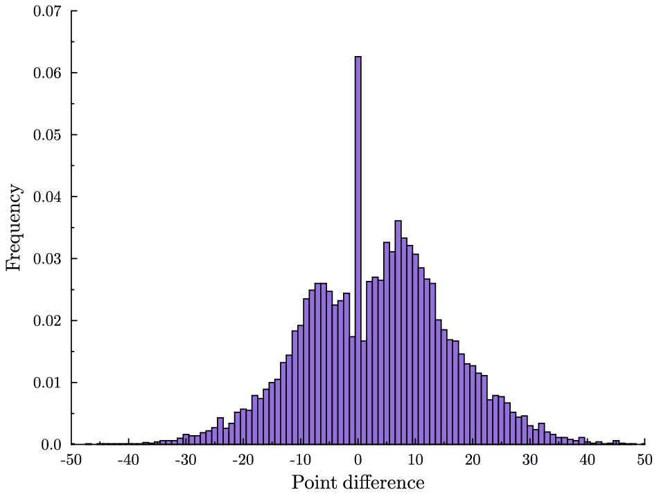
Thursday night we had another overtime game in the NBA finals. For the sake of context, here is a plot of the time series of point differential. Orlando minus LA.

A few of the commenters on the previous post nailed the late-game strategy behind the eye-popping animation. First, at the end of the game, the team that is currently behind will intentionally foul in order to prevent the opponent running out the clock. The effect of this in terms of the histogram is that it throws mass out away from zero. But the ensuing free-throws might be missed and this gives the trailing team a chance to close the gap. So the total effect of this strategy is to throw mass in both directions.
If the trailing team is really lucky both free throws will be missed and they will score on the subsequent possession and take the lead. Now the other team is trailing and they will do the same. So we see that at the end of the game, no matter where we are on that histogram, mass will be thrown in both directions, until either the lead is insurmountable, or we land right at zero, a tie game.
Once the game is tied there is no more incentive to foul. But there is also no incentive to shoot (assuming less than 24 seconds to go.) The leading team will run the clock as far as possible before taking one last shot.
So there are two reasons for the spike: risk-taking strategy by the trailing team increases the chance of landing at a tie game, and then conservative strategy keeps us there. The following graphic (again due to the excellent Toomas Hinnosaar) illustrates this pretty clearly.
 In blue you have the distribution of point differences that we would get if we pretented that the teams’ scoring was uncorrelated. This is what I referred to as the crude hypothesis in the previous post. In red you see the extra mass from the actual distribution and in white you see the smaller mass from the actual distribution. We see that the actual distribution is more concentrated in the tails (because there is less incentive to keep scoring when you are already very far ahead), less concentrated around zero (because of risk-taking by the trailing team) and much more concentrated at the point zero (because of conservative play when the game is tied.)
Now, this is all qualitatively consistent with the end-of-regulation histogram and with the animation. The big question is whether it can explain the size of that spike quantitatively. Obviously, not all games that go into overtime follow this pattern. For example, Thursday’s game did not feature intentional fouling at the end. How can we assess whether sound strategy alone is enough to explain the frequency of overtime?
Although men and women follow a similar number of Twitter users, men have 15% more followers than women. Men also have more reciprocated relationships, in which two users follow each other. This “follower split” suggests that women are driven less by followers than men, or have more stringent thresholds for reciprocating relationships. This is intriguing, especially given that females hold a slight majority on Twitter: we found that men comprise 45% of Twitter users, while women represent 55%. To get this figure, we cross-referenced users’ “real names” against a database of 40,000 strongly gendered names.
Even more interesting is who follows whom. We found that an average man is almost twice more likely to follow another man than a woman. Similarly, an average woman is 25% more likely to follow a man than a woman. Finally, an average man is 40% more likely to be followed by another man than by a woman. These results cannot be explained by different tweeting activity – both men and women tweet at the same rate.
And this makes Twitter different than other social networks:
These results are stunning given what previous research has found in the context of online social networks. On a typical online social network, most of the activity is focused around women – men follow content produced by women they do and do not know, and women follow content produced by women they knowi
(See the article here. via MR.) Actually this may not be stunning at all because there is probably a very simple explanation for both observations. Twitter is a one-way social network. If I want to follow you I do not need your permission. Unless you block everybody and require followers to ask permission.
Regardless of the social network, women are less willing than men to allow unsolicited followers and so they are more inclined to require permission. So for example if I just randomly selected 100 Twitter users to follow, there will be many of those 100 whom I will be unable to follow because they require permission. Most of those will be women. Thus, on Twitter the ratio between the number of followers of a random woman to the number of followers of a random man will be smaller than the same ratio on, say, Facebook. And everybody will follow more men on Twitter than on Facebook.
In an article about their famous restaurant surveys, Nina and Tim Zagat write
Over the years that we’ve spent surveying hundreds of thousands of diners, one fact becomes clear: Service is *the* weak link in the restaurant industry. How do we know? Roughly 70% of all complaints we receive relate to service. Collectively, complaints about food prices, noise, crowding, smoking, and even parking make up only 30%. Moreover, the average rating for food on our 30-point scale is usually two points higher than the average rating for service. Given the fact that identical people are voting, and that there are hundreds of thousands of them, this deficit is dramatic.
They go on to give some advice to the restaurant industry for improving service. But don’t these results say that in fact we don’t care about service? They show that we choose the restaurants with good food despite their bad service. Sure we complain about the service, other things equal who doesn’t want better service. But we can live with bad service if we get good food.
No, not because of this, although it can get rough.
I teach the third course in the first year PhD micro sequence at Northwestern and I also teach my intermediate micro course in the Spring. I am just finishing up teaching this week and my students will soon be writing their evaluations of me. They will grade me on a scale of 1 to 6.
Because I am the third and last teacher they will evaluate this year, I face some additional risk that my predecessors did not. Back in the fall, when they evaluated their first teacher they had only one data point with which to estimate the distribution of teaching ability in the Northwestern economics faculty. An outstanding performance would lead them to revise upward their beliefs and a poor performance would revise their beliefs downward.
As a result, when the students sit down to evaluate their fall professor, even a very good performance will earn at most a 5 because the students, now anticipating higher average performance in the winter and spring, will be inclined to hold that 6 in reserve for the best. Likewise, very bad performances will have their ratings buoyed by the student’s desire to save the 1 for the worst.
When Spring comes, there is nothing more to learn. By now they know the distribution and the only thing left to do is to rank their Spring professor relative to those who came earlier. If he is best he gets a 6, if not he gets at most a 4. His rating is a mean-preserving spread of the previous ratings.
There is a general principle at work here. The older you get the more you know about your opportunity costs, the more decisively you act in response to unanticipated opportunities. (There is a countervailing force which I believe on net makes us more conservative when we get older, but that is the topic of a later post.)
Let’s try a little (thought) experiment in verbal short-term memory. First, find a friend. Then, find a reasonably complex sentence about 45 words long …Now call your friend up on the phone, and have a discussion about the topic of the article. In the course of this conversation, slip in a verbatim performance of the selected sentence. Then ask your friend to write an essay on the topic of the discussion. … How likely is it that the selected sentence will find its way, word for word, into your friend’s essay?
In case you haven’t guessed, the question is rhetorical and the article (from LanguageLog, a great blog) is referring to Maureen Dowd’s plagiarism. It is a fallacy though to focus only on the probability of the scenario you are trying to reject. What matters is the relative probability of that scenario with the alternative scenario, namely that Maureen Dowd would bother (intentionally) lifting word for word a paragraph which is not particularly insightful or cleverly written from a popular blog at the risk of being called a plagiarizer.
When something happens that has two very unlikely explanations, picking one of those explanations is mostly driven by your priors.
Suppose that a plane has just landed and a flu pandemic may be emerging. You have the time and resources to check some but not all of the arriving passengers for signs of influenza. A small fraction of the passengers are arriving from Mexico where the pandemic originated and the others have not been to Mexico. How do you allocate your searches?
Efficient screening means that the probability of finding an infected passenger should be equalized across the groups that you screen. And if searches of one group yield a higher infection rate than another then you should allocate your searches to the first group. Since the passengers arriving from Mexico are much more likely to be infected, you will probably use all of your searches on them.
Even though the passengers from Mexico are being searched disproportionally more often than the others, this is not because you are discriminating against them. Your motive is simply to use your limited resources most effectively to stop the spread of the virus.
These ideas should be kept in mind when you read articles like this one (via The Browser) which claim that the disproportionate number of searches of black motorists on the highways indicates that the police are racially biased. The police probably are racists, this would not surprise anybody. But the fact that they stop and search black motorists more often than whites is not evidence of racism, unless it can be shown that the proportion of stopped black motorists who are found to be committing a crime is smaller than the proportion of stopped white motorists.
In fact, this 2001 paper by Knowles, Persico, and Todd test for this using one particualar data set and find no evidence of bias. I don’t know where the literature has gone since then, probably there have been other studies with other findings, but its important to know what the right test is.
A recent Slate article “The messy room dilemma: when to ignore behavior, when to change it” by tackles the important topic of when you should ignore your child’s undesirable behavior and when you should intervene. The authors use a series of intriguing percentages to suggest that many childhood behaviors will change on their own if you just wait long enough. Here’s an excerpt:
Many unwanted behaviors, including some that disturb parents, tend to drop out on their own, especially if you don’t overreact to them and reinforce them with a great deal of excited attention. Take thumb sucking, which is quite common up to age 5. At that point it drops off sharply and continues to decline. Unless the dentist tells you that you need to do something about it right now, you can probably let thumb sucking go. The same principle applies for most stuttering. Approximately 5 percent of all children stutter, usually at some point between ages 2 and 5. Parents get understandably nervous when their children stutter, but the vast majority of these children (approximately 80 percent) stop stuttering on their own by age 6. If stuttering persists past that point or lasts for a period extending more than six months, then it’s time to do something about it.
There are a lot more behaviors, running the range from annoying to unacceptable, in this category. Approximately 60 percent of 4- and 5-year-old boys can’t sit still as long as adults want them to, and approximately 50 percent of 4- and 5-year-old boys and girls whine to the extent that their parents consider it a significant problem. Both fidgeting and whining tend to decrease on their own with age, especially if you don’t reinforce these annoying behaviors by showing your child that they’re a surefire way to get your (exasperated) attention. Thirty to 40 percent of 10- and 11-year-old boys and girls lie in a way that their parents identify as a significant problem, but this age seems to be the peak, and the rate of problem lying tends to plummet thereafter and cease to be an issue. By adolescence, more than 50 percent of males and 20 percent to 35 percent of females have engaged in one delinquent behavior—typically theft or vandalism. For most children, it does not turn into a continuing problem.
The logic would seem to be don’t worry about the thumb sucking, the stuttering, the lying and so on. It will probably go away on its own and look there are many statistics to back this up … but this is a total fallacy. Suppose all of the statistics are completely accurate. It still doesn’t follow that they suggest you should just ignore behavior that you deem to be a problem.
I am guessing that most parents faced with unwanted behaviors like thumb sucking, stuttering, lying, and certainly, theft or vandalism intervene in some way, possibly many parents even “reinforce them with a great deal of excited attention.” The percentages reflect the impact of this intervention as well — 50% of adolescent boys do something delinquent, their parents justifiably freak out and only a small number do it again. This decidedly does not argue for doing nothing when you are concerned about your child’s behavior. We don’t know what fraction of young vandals would become repeat offenders if their parents ignored their behavior. All we know is that when the typical kid misbehaves and his or her parents react in a typical fashion, the behavior eventually goes away most of the time. The statistics are mute on whether this is because of, or in spite of, parental intervention.
