
I once wrote about height and speed in tennis arguing that negative correlation appears at the highest level simply because they are substitutes and the athletes are selected to be the very best. At the blog MickeyMouseModels.blogspot.com, there is a post which shows very nicely the effect using simulated data. Quoting:
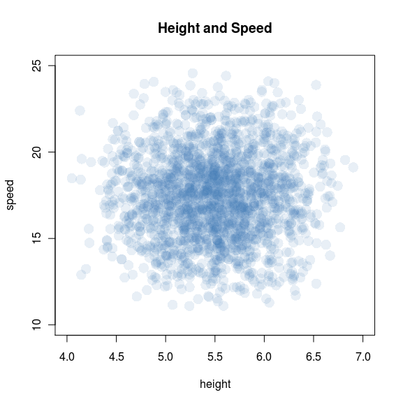
Suppose that, in the general population, the distribution of height and speed looks roughly like this:
Where did I get this data? It’s entirely hypothetical. I made it up! That said, I did try to keep it semi-realistic: the heights are generated as H = 4 + U1 + U2 + U3 feet, where the U are independently uniform on (0, 1); the result is a bell curve on (4, 7) feet, which I prefer to the (-Inf, +Inf) of an actual normal distribution. (I’ve created something similar to the N=3 frame in this animation.)
The next step is to give individuals a maximum footspeed S = 10 + U4 + U5 + U6 mph, with the U independently uniform on (0, 5). By construction, speed is independent from height, and falls more or less in a bell curve from 10 to 25 mph. Fun anecdote: my population is too slow to include Usain Bolt, whose top footspeed is close to 28 mph.
Back to tennis. Let’s imagine that tennis ability increases with both height and speed — and, moreover, that those two attributes are substitutable: if you’re short (and have a weak serve), you can make up for it by being fast. With that in mind, let’s revisit the scatterplot:
There it is: height and speed are independent in the general population, but very much dependent — and negatively correlated — among tennis players. The plot really drives the point home: top athletes will be either very tall, very fast, or nearly both; and excluding everyone else creates a downward slope.


6 comments
Comments feed for this article
May 23, 2011 at 2:23 pm
tomslee
But where does this assumption come from, that height and speed are substitutes? And why has no one told Mr. Bolt?
May 24, 2011 at 12:29 pm
Donald A. Coffin
This also reinforces my conclusion that, where there are selection constraints, distributions (of those selected) become non-normal very quickly. And when we are selecting *for* a characteristic, more than half of the people selected will be *below average* (average=mean) for that characteristic.
May 24, 2011 at 8:33 pm
Frank
I remember seeing this (drawn on the board) in IO, I think.
That is one cool blog. It looks like the author didn’t follow your advice (stocking up on posts so as to not run dry), though.
May 24, 2011 at 8:34 pm
Frank
Oh wait, I just realized that top post about Schelling’s model fails to talk about Schelling’s model.
May 25, 2011 at 2:00 pm
ALT
Hey, thanks for linking to my blog! You actually caught me a bit off-guard: most of my posts aren’t finished yet, and I thought I had a little more time before any readers showed up…
August 1, 2011 at 9:56 am
Concavity « Really? I'm going to write about that on my blog.
[…] dumber and fellows with humongous brains have relatively smaller packages. Jeff Ely explains a similar idea from sports. Eco World Content From Across The Internet. Featured on EcoPressed Stress and […]